Vindral Player
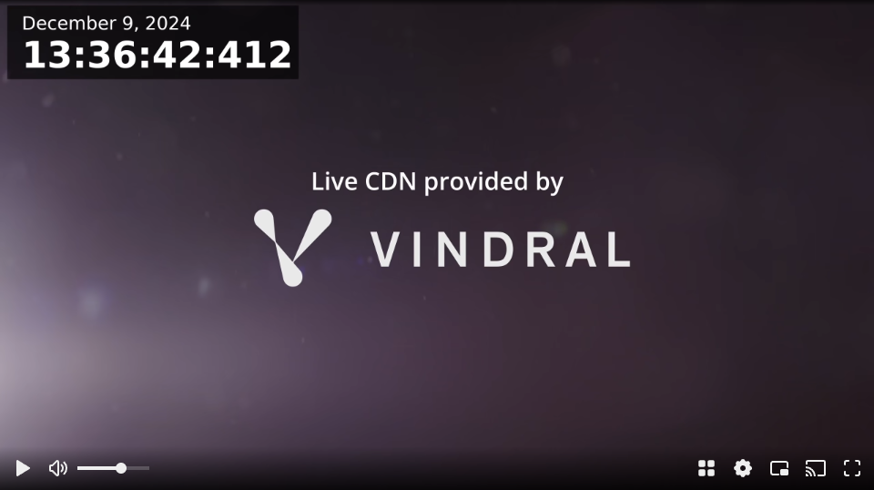
Vindral Player is our ready-to-go web component-based player for easy integration into your web applications. It is ideal for customizing controls or when the embed solution is not sufficient.
Installation
Install @vindral/web-sdk using npm:
npm install --save @vindral/web-sdk
Equivalent for yarn:
yarn add @vindral/web-sdk
Hosted via jsDelivr
The jsDelivr CDN (https://cdn.jsdelivr.net) is a third-party service and is not operated by Vindral. When using this script-tag distribution, pin an explicit package version instead of relying on the latest release so future updates do not change your integration unexpectedly.
<script type="module" async src="https://cdn.jsdelivr.net/npm/@vindral/[email protected]/vindral-player-component.js"></script>
Example with JavaScript and HTML
To be able to use the <vindral-player /> in your HTML you have to call registerComponents.
JavaScript
import { registerComponents } from "@vindral/web-sdk/player"

registerComponents()
HTML
<vindral-player
  url="https://lb.cdn.vindral.com"
  channel-id="vindral_demo2_ci_dbd1ca98-4e05-4a36-8215-0e8bca295ed2"
  min-buffer-time="1000">
</vindral-player>
Or use vindral-player-component.js, which is a self-registering variant of the web components player intended to be used from a script tag. After loading the pinned script above, you can use it directly in your HTML.
HTML
<vindral-player
  url="https://lb.cdn.vindral.com"
  channel-id="vindral_demo2_ci_dbd1ca98-4e05-4a36-8215-0e8bca295ed2"
  min-buffer-time="1000">
</vindral-player>
Configuration
Vindral Player can easily be configured with HTML attributes and supports most of the same options as the core Web SDK in the web-sdk.
Some common core option attributes are:
channel-id- (required) which channel to connect to.channel-group-id- when connecting to a channel group.muted- start muted.authentication-token- used when connecting to authed channels.min-buffer-time- Vindral's configurable latency: adjust from 100ms (ultra-low) to 5000ms+ (high stability). Default is 1500ms.max-buffer-time- set this to enable dynamic latency adjustment. By default, this will be disabled (set to same as min-buffer-time).max-video-bit-rate- constrain video bitrate.max-size- constrain video width and height.
For advanced playback-pipeline tuning, vindral-player also supports:
decoders="webcodecs,mse,wasm"- prefer WebCodecs, then fall back to MSE and WASMoffscreen-canvas-enabled="false"- explicitly disable worker-side OffscreenCanvas rendering; when omitted, WebCodecs enables it automatically when supportedstream-to-media-element-enabled="true"- route canvas-rendered output through a media element for fullscreen/PiP support in non-MSE mode. Default isfalse.webcodecs-hardware-acceleration="prefer-software"- control whether WebCodecs should prefer hardware or software decoding
Example:
<vindral-player
  url="https://lb.cdn.vindral.com"
  channel-id="vindral_demo2_ci_dbd1ca98-4e05-4a36-8215-0e8bca295ed2"
  min-buffer-time="1000"
  decoders="webcodecs,mse,wasm"
  stream-to-media-element-enabled="true"
  webcodecs-hardware-acceleration="prefer-software">
</vindral-player>
See WebCodecs & Offscreen Renderer for the rendering-path tradeoffs behind these attributes.
The following controls will also appear in some use cases based on support detection:
castairplaypipfullscreen
And can be enabled and disabled like this:
<vindral-player
  url="https://lb.cdn.vindral.com"
  channel-id="vindral_demo2_ci_dbd1ca98-4e05-4a36-8215-0e8bca295ed2"
  min-buffer-time="1000"
  airplay
  cast
  pip="false"
  fullscreen="false"
  >
</vindral-player>
These controls default to true except AirPlay.
Read the full API reference for all the attributes
Controls and UI
Vindral Player includes all predefined controls for ease of use. It also comes with a responsive design that can automatically arrange controls and offers extensive customization options.
Demonstrating the responsive design for small players:
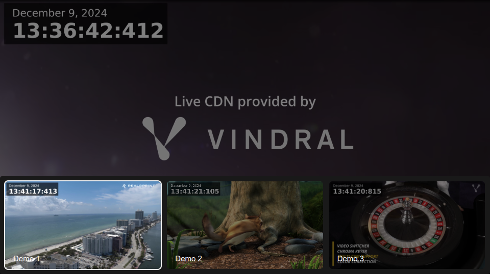
Channel switching with our built-in grid is available when providing a channel-group-id:
<vindral-player
  url="https://lb.cdn.vindral.com"
  channel-id="vindral_demo2_ci_dbd1ca98-4e05-4a36-8215-0e8bca295ed2"
  channel-group-id="vindral_demo_pk_932730be-db0c-46a0-a592-cfce7bdc5a43"
  min-buffer-time="1000"
>
</vindral-player>
Styling With CSS
The vindral-player HTML element can be styled with CSS like any other HTML element. For example:
vindral-player {
  max-width: 100%;
  max-height: 100%;
  --vindral-fg-strong: pink;
  aspect-ratio: 16 / 9;
}
CSS Variables
CSS variables are custom properties that allow you to define reusable values in your CSS. They can be used to customize the appearance of the vindral-player element.
To control the visibility of various player elements:
vindral-player {
  /* Hide all controls */
  --vindral-ui-display: none;

  --vindral-play-button-display: none;
  --vindral-mute-button-display: none;
  --vindral-airplay-button-display: none;
  --vindral-pip-button-display: none;
  --vindral-fullscreen-button-display: none;
  --vindral-cast-button-display: none;
  --vindral-grid-button-display: none;
  --vindral-grid-item-offline-display: none;
  --vindral-volume-range-display: none;
  --vindral-rendition-menu-display: none;
  --vindral-language-menu-display: none;
  --vindral-play-overlay-display: none;
  --vindral-buffering-overlay-display: none;
}
These CSS variables allow you to customize the appearance of the player.
vindral-player {
  --vindral-fg-strong: #000000;
  --vindral-fg-subtle: #666666;
  --vindral-fg-extra-subtle: #999999;

  --vindral-bg-strong: #ffffff;
  --vindral-bg-subtle: #f2f2f2;
  --vindral-bg-extra-subtle: #e6e6e6;

  --vindral-bg-component: #cccccc;
  --vindral-bg-component-hover: #b3b3b3;
  --vindral-bg-component-active: #999999;

  --vindral-padding-1: 4px;
  --vindral-padding-2: 8px;
  --vindral-padding-3: 12px;
  --vindral-padding-4: 16px;
  --vindral-padding-5: 32px;

  --vindral-control-padding: 4px;
  --vindral-button-padding: 8px;
  --vindral-ui-font: Arial, sans-serif;
}
Vindral Controller
For more customization, the Player library provides a collection of components.
<vindral-controller /> supports the same attributes as <vindral-player /> but doesn't come with predefined controls.
Example of building your own player:
<vindral-controller
  url="https://lb.cdn.vindral.com"
  channel-id="vindral_demo2_ci_dbd1ca98-4e05-4a36-8215-0e8bca295ed2"
  min-buffer-time="1000"
>
  <vindral-control-bar slot="top-bar">
    <vindral-rendition-levels-menu></vindral-rendition-levels-menu>
  </vindral-control-bar>
  <vindral-control-bar>
    <vindral-play-button></vindral-play-button>
    <vindral-mute-button></vindral-mute-button>
    <vindral-pip-button slot="right"></vindral-pip-button>
    <vindral-airplay-button slot="right"></vindral-airplay-button>
    <vindral-fullscreen-button slot="right"></vindral-fullscreen-button>
  </vindral-control-bar>
  <vindral-buffering-overlay slot="overlay"></vindral-buffering-overlay>
</vindral-controller>
Slots
Slots are like placeholders in custom elements where you can add your own content.
vindral-controller
- no slot(default slot): Places elements in the bottom
- slot="top-bar": Places elements in the top.
- slot="middle": Places elements in the middle.
- slot="overlay-interactive": Places element in the overlay area.
- slot="overlay": In contrast to the other slots "overlay" isn't shown/hidden on user interaction.
control-bar
- no slot(default slot): Places elements on the left side of the control bar.
- slot="right": Places elements on the right side of the control bar.
buttons
- slot="icon": Allows you to replace the default icon.
<vindral-play-button>
  <span slot="icon">Play</span>
</vindral-play-button>
Components
A list of available web components:
- vindral-player
- vindral-controller
- vindral-control-bar
- vindral-play-button
- vindral-mute-button
- vindral-buffering-overlay
- vindral-scroll-overlay
- vindral-play-overlay
- vindral-user-input-play-overlay
- vindral-fullscreen-button
- vindral-rendition-levels-menu
- vindral-channel-grid-button
- vindral-channel-grid
- vindral-pip-button
- vindral-airplay-button
- vindral-cast-button
- vindral-cast-overlay
- vindral-buffering-icon
- vindral-language-menu
- vindral-volume-range
TypeScript
If you are using TypeScript, you can use the exported VindralHTMLElementTagNameMap to get typings as shown below:
import { VindralHTMLElementTagNameMap, registerComponents } from "@vindral/web-sdk/player"

declare global {
  interface HTMLElementTagNameMap extends VindralHTMLElementTagNameMap {}
}

registerComponents()

const player = document.createElement("vindral-player")
React
React typings for our web components are exported in the @vindral/web-sdk/react package. To ensure TypeScript picks up the types, update your tsconfig.json file as follows:
{
  "compilerOptions": {
    "types": ["@vindral/web-sdk/react"]
  }
}
Accessing the Core SDK
Both vindral-player and vindral-controller expose the Vindral Live client instance. You must wait for the "vindral-instance-ready" event before it becomes available.
const player = document.createElement("vindral-player")

player.addEventListener("vindral-instance-ready", () => {
    player.instance.on("error", (error) => {
      console.error("error", error)
    })
    player.instance.on("playback state", (state) => {
      console.log("playback state", state)
    }
})


